What if your money app felt a little less like banking, and a lot more like your life?
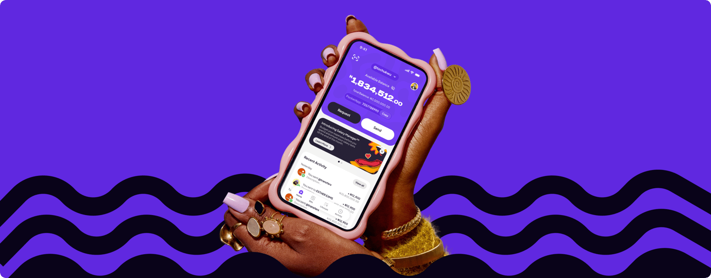
Pocket was growing. The brand had become more expressive, the product ambition had expanded, and the app was doing much more than moving money around. The redesign was about helping the experience catch up — making Pocket faster, more playful and more alive, without losing the depth of what it could do.
- —
- Launch Users
- —
- Transactions
- —
- Salary Manager
- —
- Engagement
The Challenge
The identity had grown. The app still felt like the old Pocket.
Pocket was already capable, but visually it was beginning to feel dated and increasingly disconnected from what the product wanted to become.
The challenge wasn’t simply giving the app a visual refresh. It was building an experience broad enough for transfers, bills, cards, budgeting, salary management and lifestyle features without making Pocket feel like a drawer full of financial utilities. More things to do couldn’t mean more things to think about.
The Idea
Make Pocket feel as quick as the things you use it for.
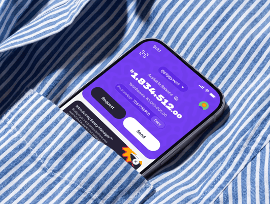
The redesign started from a fairly simple principle: financial software didn’t have to feel slow, formal or overly precious. Pocket needed to move.
That meant reducing friction between intent and action, tightening navigation, making common tasks easier to reach and creating an interaction system that felt responsive enough for something people could open several times a day. The goal wasn’t minimalism for its own sake. Pocket was going to remain feature-heavy. It just shouldn’t feel feature-heavy.
Rebuilding the core
Sending money should barely interrupt what you were doing before it.
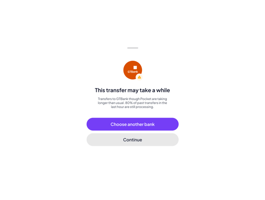
Transfers were one of Pocket’s most important behaviours, so a large part of the redesign focused on making Send quicker and more flexible.
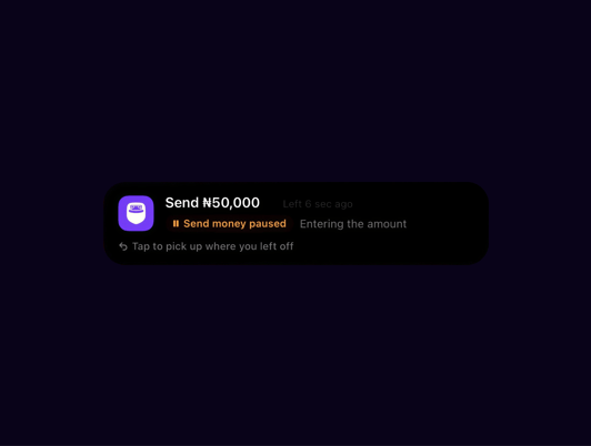
Instead of treating every transfer like a form to complete, we designed multiple ways into the same action: typing account details, scanning, pasting, sending through tags, Quick Send and returning to unfinished transfers using live activities. Pocket-to-PiggyVest transfers and other common money movements followed the same rule: less ceremony, fewer unnecessary decisions, and a clearer path from “I need to do this” to “done.”
Salary Manager
Getting paid is one event. Managing everything after is the actual job.
Salary Manager became one of the clearest expressions of what the new Pocket could be. Instead of showing users money and leaving the rest up to them, we designed a system for planning what that money needed to do next.
Users could divide income into buckets, create budgets, automate recurring payments, set aside money for future expenses and still earn interest on money that had already been budgeted. The important shift was from tracking money to actively organising it.
Automation
The nicest financial task is the one you no longer have to remember.
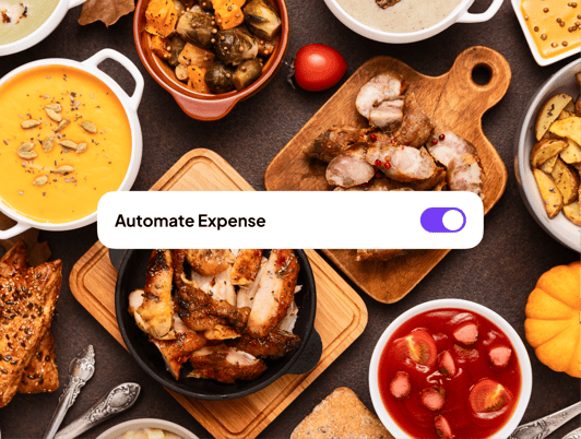
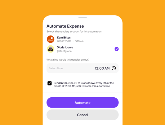
Automation became an important part of making Pocket feel faster. Payments could happen automatically. Budget allocations could happen automatically. Recurring financial habits could be set once and allowed to run quietly in the background.
But automation only works when people still understand what the product is doing. So the design work was about making recurring behaviours visible, editable and predictable enough that handing something over to Pocket still felt like being in control. Less remembering. Not less understanding.
Built around real life
Your finances are only one part of your life.
Pocket was becoming useful for much more than payments, and the product needed somewhere for that expansion to live.
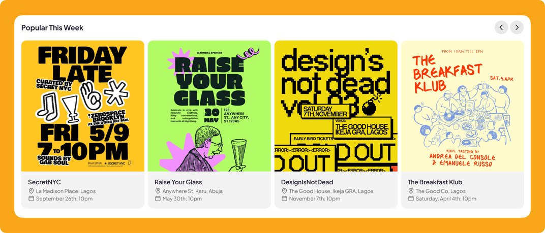
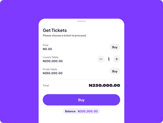
The Lifestyle experience introduced a different side of the app: events, things to do and experiences users could discover and pay for without leaving Pocket. A night out, splitting dinner, paying a bill, saving toward something, planning your salary and buying tickets could all belong to the same world. The larger ambition wasn’t to become the app where you manage money. It was to quietly power the things you use money for.
One product, a lot of surfaces
The hard part wasn’t designing more features. It was making them all feel related.
Pocket included transfers, bills, cards, groups, split payments, Salary Manager, lifestyle experiences and a growing collection of smaller tools. Each feature could have been designed independently. That would have been much easier.
Instead, the work was largely about building consistency across them: shared interaction patterns, familiar actions, predictable hierarchy and enough visual character that the product still felt unmistakably Pocket. The product could do many things. The design system had to make them feel like one thing.
Designed together
A lot of the best decisions happened after the Figma file.
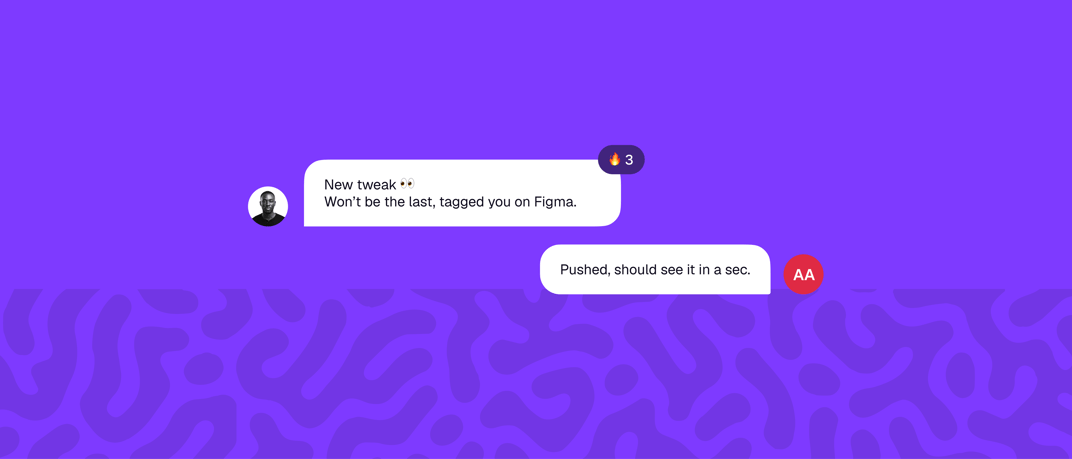
The redesign was heavily collaborative across product, design and engineering. Flows evolved while they were being built. Interaction ideas were tested against actual implementation constraints. Some things that looked obvious in static screens became much less obvious once they had to behave across different states, devices and real user data.
That back-and-forth became part of the design process rather than something that happened after it. The question was rarely just, “Can engineering build this?” It was usually, “What does this become when design and engineering solve it together?”
Sometimes, Engineering pushed features, so we tested to ensured they worked; then the design and refinement came with feedback. Shout out to the engineering team for putting up with all the tweaks at 3am.
Keeping the fun
Financial products are already serious. The interface doesn’t always need to be.
Pocket still needed to be trustworthy. It just didn’t need to look like it had a meeting in ten minutes.
The visual language used stronger colour, expressive typography, bolder imagery, playful copy, motion and smaller moments of delight to give the product more personality. Those details mattered most in places that could otherwise become extremely functional: budgeting, bills, salary planning and transfers. The goal was never to decorate the finance away. It was to make doing all of it feel lighter.
Launching Pocket
Eventually, designing the product turned into designing how we introduced it.
For launch, I also moved into design engineering and built the new Pocket website.
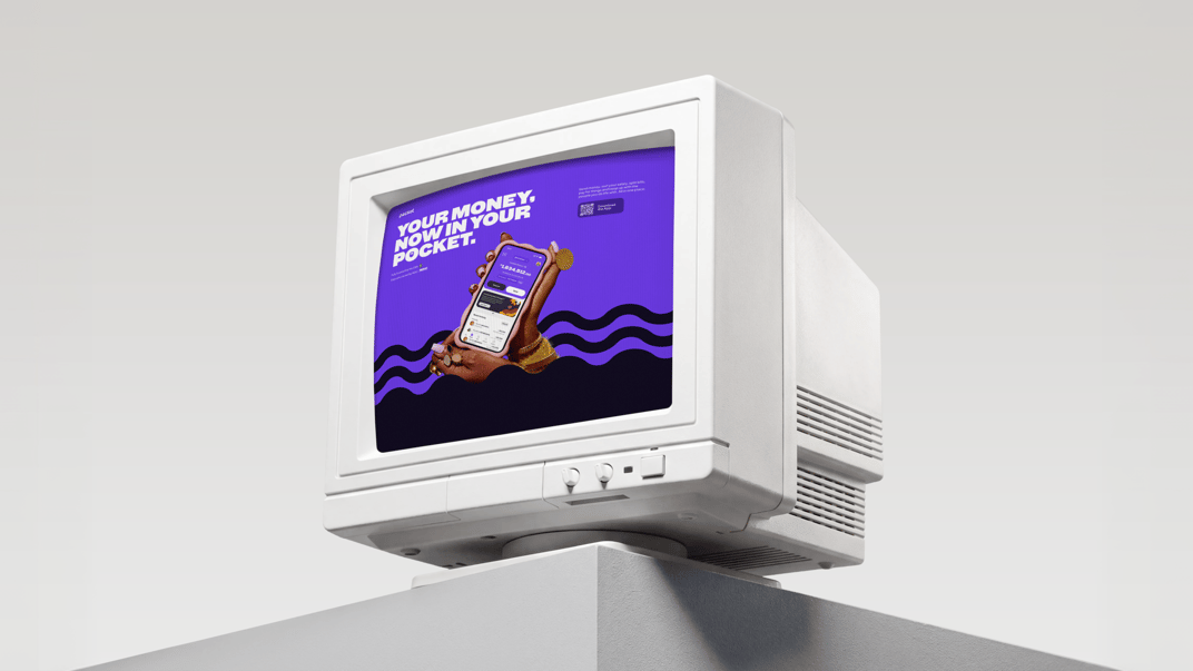
That meant taking the same visual and interaction principles from the app and translating them into a web experience: expressive layouts, motion, responsive media, feature storytelling and enough interaction for the website to feel like the product rather than a brochure about it. It was a useful full-circle moment: instead of designing a handoff for another medium, I could work directly across design and implementation and make decisions with the final browser experience in mind.
Outcomes
Pocket grew up without becoming too serious about it.
The redesign moved Pocket closer to the product it was already becoming underneath: broader than transfers, more useful than a wallet, and much more connected to everyday life. The visual refresh gave that ambition a clearer identity. The new product structure gave it room to grow.
Built for your money. Designed for everything around it.
Pocket started this redesign with more ambition than its interface could show. By the end, it had a product language that could stretch across payments, planning, budgeting, lifestyle and whatever came next without losing its personality.
The biggest lesson wasn’t that financial products need more features. Pocket already had plenty. It was that complexity can still feel fast, serious products can still have a sense of humour, and an app can do a lot without constantly reminding you how much it does.