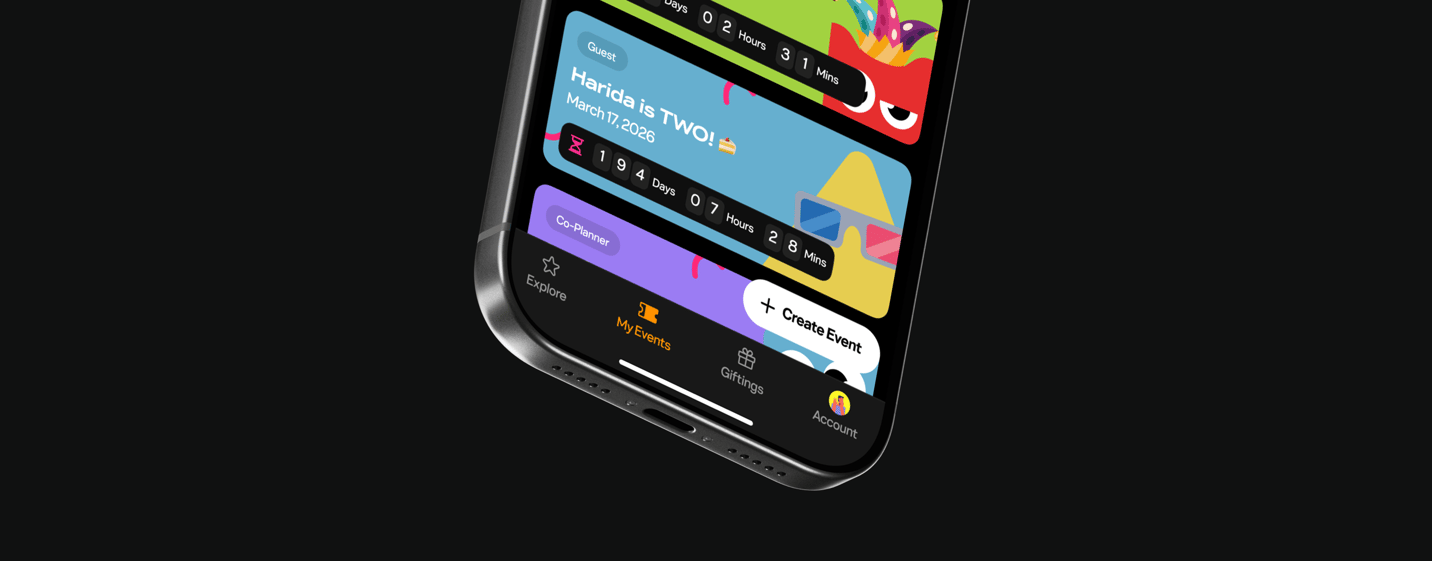
What if planning the party felt as good as the party itself?
Partyverse was built to pull the chaos of planning into one place — chats, tickets, payments, guests, vendors and all the little things that somehow become a full-time job. The challenge was making all of that feel simple without turning the product into project-management software wearing party clothes.
- 100K+
- Unique Users
- 50K+
- Events Hosted
- 310+
- Product Builds
The Challenge
Event planning is already complicated. The tools made it feel worse.
Planning even a small event could mean juggling chats, notes, transfers, guest lists, vendor contacts and spreadsheets across different apps. Bigger events only multiplied the problem.
The design challenge wasn’t simply putting all of those tools into one product. It was making them feel like one product — simple enough for a games night, but capable enough for a wedding, concert or large ticketed event. And because celebrations are emotional, social and deeply cultural, Partyverse couldn’t feel like admin software.
The Idea
Let the event grow only as complicated as it needs to be.
Instead of exposing every planning tool at once, I designed Partyverse around a modular event board. Each event starts simple, grows with whatever you need, and keeps a record of what happened after it’s over.
A five-person games night can stay lightweight. A 10,000-person event can become much more powerful without becoming a different product. That modular system became Partyverse’s product fingerprint: flexible, visual and immediately recognizable.
Building the core
One event. A lot of moving parts.
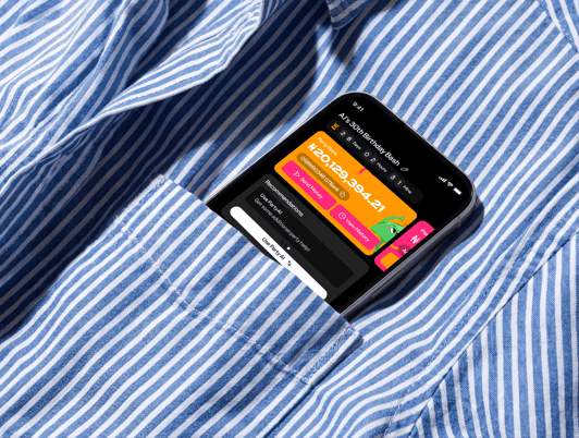
The tricky part wasn’t designing individual features. It was making planning, payments, gifting, ticketing, budgeting, guests and collaboration behave like parts of the same system.
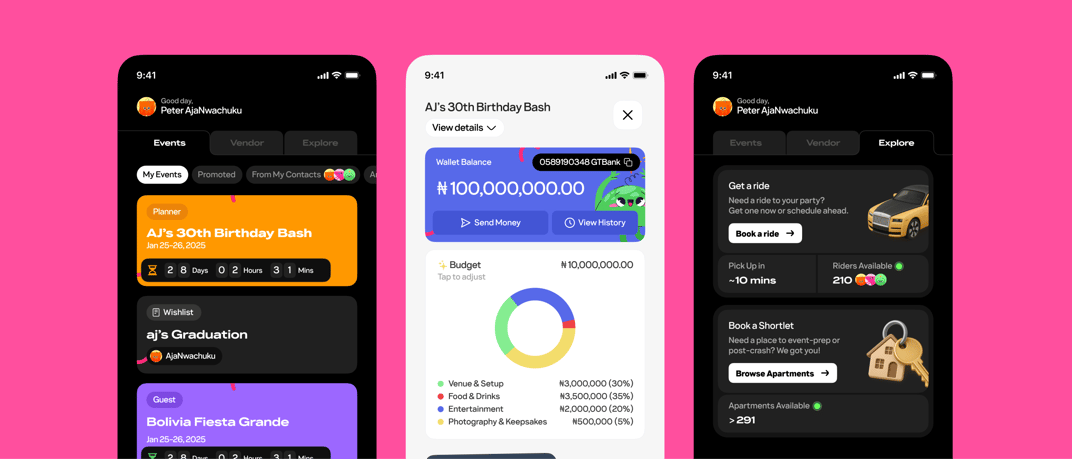
Every feature had to understand the rest of the event. A vendor payment should affect the budget. A gift could become cash in the event wallet. Ticket sales needed to connect to attendance. The goal was to avoid a Frankenstein of useful features and build one coherent planning model instead.
Closing the loop
And when the event ends, the data doesn’t disappear.
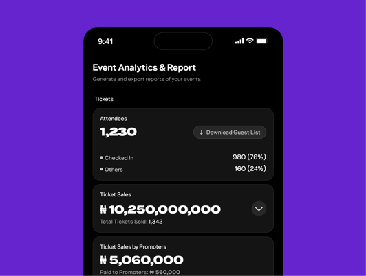
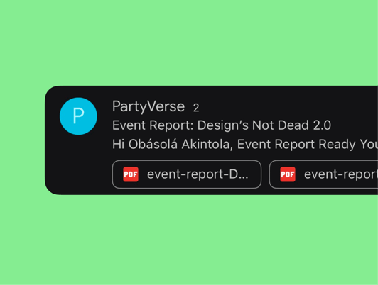
After an event, hosts could request a downloadable Event Report bringing everything together: inflows and outflows, guest lists, check-ins, discount-code usage, attendee demographics and other key event data.
It turned Partyverse from something that helped you run an event into something that could also tell you how the event actually went.
Designing with context
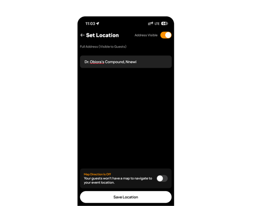
A map pin isn’t always an address in Lagos.
Partyverse worked best when we stopped designing for an abstract “event planner” and paid attention to how people actually organize things here.
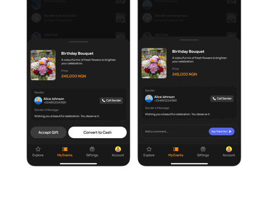
For locations, that meant supporting full addresses and landmark-based directions instead of assuming a Maps pin would be enough. For gifting, it meant letting recipients convert a gift to cash and add it directly to their event wallet — with a thank-you note, because that part matters too. Small contextual decisions like these made the product feel less imported and more like it understood the reality it was built for.
Expanding the room
We built for hosts first. Then realised the party was bigger than the host.
Early versions of Partyverse were heavily optimized around the person organizing the event. That made sense — until it became obvious that attendees, collaborators and people looking for something to do were just as important to the experience.
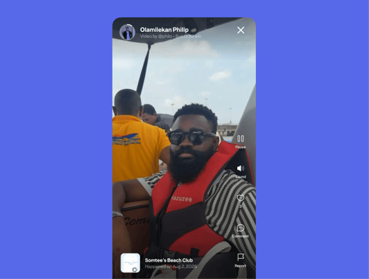
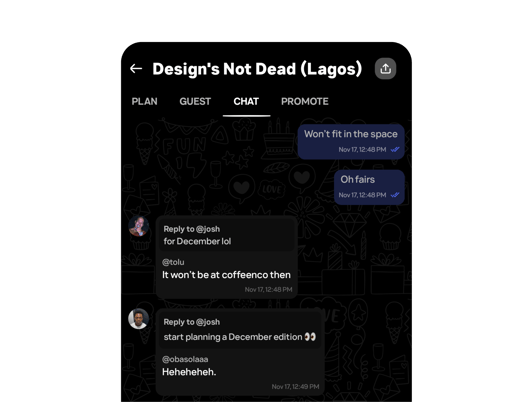
That insight led to Explore for discovering events, Memories for collecting everyone’s photos in one place, and Chat so planning conversations didn’t immediately escape back into WhatsApp or iMessage. The product started as a planning tool. It was becoming an event ecosystem.
Shipping the thing
Build 310.
Partyverse moved absurdly fast. Research, design, engineering, QA and beta feedback were often happening at the same time, sometimes with a TestFlight build ready the day after a flow was designed.
By build 310, some ideas had survived, others had been redesigned repeatedly or removed entirely. The operating principle was simple: ship, watch, adjust — and don’t get emotionally attached to a screen just because it took a week to design.
Keeping the fun
Useful wasn’t enough. It had to feel like a party app.
Planning is work. The product didn’t need to remind people of that.
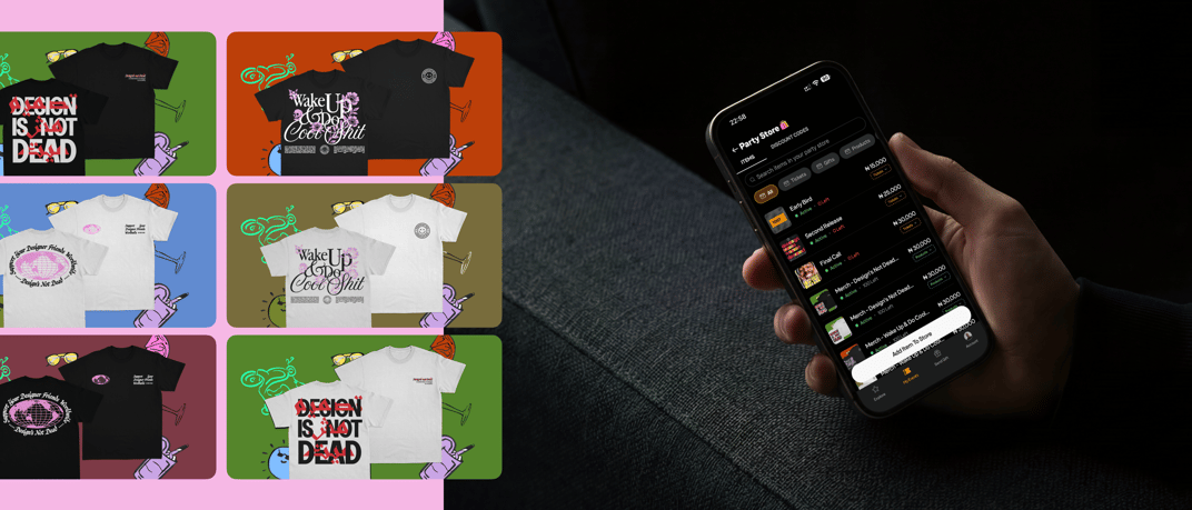
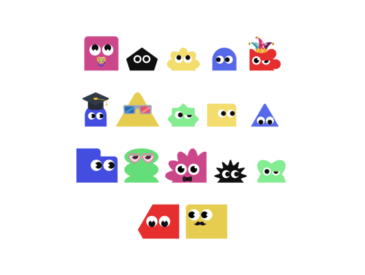
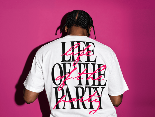
We used playful avatars, expressive empty states, custom typography, shareable RSVP pages, motion and a warmer tone of voice to keep joy visible throughout the product — even in very functional moments like budgets, payments and guest management. The nicest feedback we got was also the simplest: “this app just feels fun.” That was the brief.
Outcomes
People started planning events just to use it.
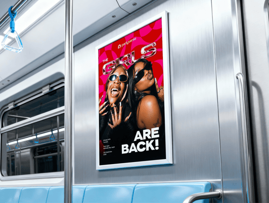
Partyverse launched as a living product, not a concept. What started as a small-team sprint grew into an app used by more than 100,000 people, with over 50,000 events created on the platform — from small personal gatherings to Adekunle Gold’s sold-out show at the National Theatre.
The best event-planning app should eventually disappear into the event.
Partyverse started with a simple ambition: make hosting feel possible for people who don’t think of themselves as planners. The modular board made complexity optional, context made the product feel native to how people actually celebrate, and constant iteration made it better.
You should remember the party, not the admin that got you there.
Using Partyverse took me from the ‘thinking about it’ phase to the actual ‘putting it in motion’ phase very quickly. Maybe even too quickly.
 aj’s still writing